Analysis of Anti-Vax Graphs by Robert Webb |
The anti-vaccine movement sometimes presents graphs to support their cause, supposedly to show that diseases were on the decline before vaccines came along, and that vaccines had no effect. Graphs seem hard to argue with. They look scientific, represent actual data, and are compelling to many people. And indeed a good graph should be compelling. But their graphs are not good. Let's have a look at how the true data, which supports the fact that vaccines have had a huge positive effect, can be manipulated to manufacture the conclusion the anti-vax movement wants.
Death rates
Firstly, most of the graphs they show are of death rates, not infection rates. Yes, death rates dropped significantly before vaccines were introduced because other improvements in medicine and sanitation meant that we were better at treating the disease, but it does not indicate that less people had the disease to begin with.They also tend to show graphs going back a long time to when death rates for common diseases like measles were very high. To fit these high figures on the graph it's necessary to scale down all the figures, meaning that by the time the vaccine is introduced you can no longer see any drop it may have caused in deaths.
They never show graphs of death rates from third world countries where due to poor sanitation etc. death rates for diseases like measles can still be quite high.
Here's a nice graph though showing both infection and death rates in the US and it's clear from both that the 1963 vaccine had a huge effect.
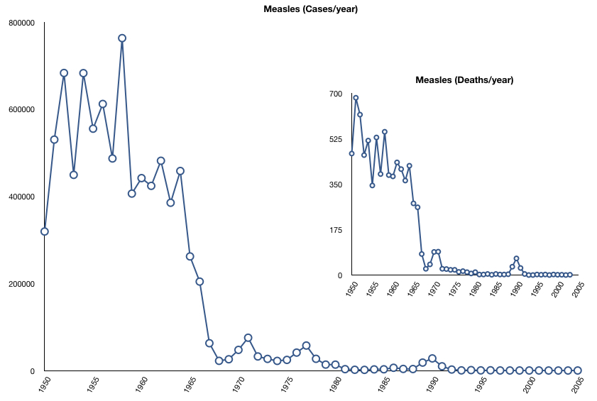
Source: http://www.iayork.com/MysteryRays/2009/09/02/measles-deaths-pre-vaccine/
The anti-vaxxers claim (e.g. here) that death rates are more reliable than infection rates because they don't trust the diagnoses made by doctors. The idea is that doctors are biased against diagnosing a disease if the patient has been vaccinated against it. But if the symptoms match, why wouldn't they test for it? We all know that vaccines are not 100% effective. The above graph shows that infection and death rates are very closely matched, year by year, so it seems that the doctors' diagnoses match the coronors' reports, so where's the evidence for this supposed misdiagnosis?
Infection rates
So the best way to see if a vaccine worked is to look at infection rates. I've only seen one infection graph presented by the anti-vax side (in several places, but I found it on the AVN website), so let's look at that in some detail. Here it is: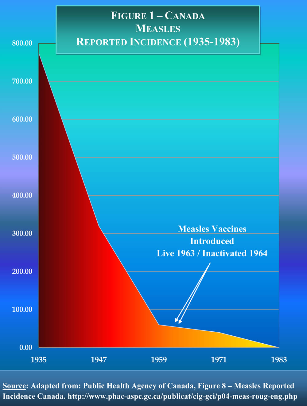
This graph has already been demolished on Science-Based Medicine, so I'll try not to repeat too much of that, though I need to recap a little. Mostly I want to show some new graphs (in the next section) that help explain what Dr. Raymond Obomsawin did to create his graph, and how easily his techniques can be used to get any result you want.
Dr. Obomsawin gives
this
link
as his source for the graph. Here's the original graph:
[Update: the PHAC has since updated their graph and fixed the error of the
phantom 1959 data point which I mention below. Follow the link above to see
their updated graph]

But a better graph of the same data, where actual data points are shown, can be seen here:

So what's wrong with the graph?
Here's some (but not all) of the ways that this graph deceives us.- First, note the slight difference between these last two graphs. The
latter graph shows a different point in 1959, before there was a ten year break
in national reporting of measles. It appears to be a glitch in the former
graph, showing a data point in 1959 when no data is available for that year.
My guess is that the graph was made as if all data points were equally spaced,
then the ten year gap was inserted, giving the impression that the graph dips
down before the introduction of the vaccine, when in fact the dip should be
spread across the gap in reporting where the vaccine was introduced. Dr.
Obomsawin's graph makes good use of this non-existence point. I have recreated
his graph over the top of the best version of the original graph:
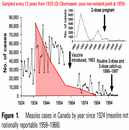
- You'll also notice immediately that his graph looks nothing like the source
graph. This is because he has only used a data point every 12 years. So he
has taken a graph with 68 data points, and used only 5 of them!
When accused of cherry picking the data,
he responds:
- "the data was not selectively "cherry picked", but rather consistently spaced giving accurate data for every 12th year running from 1935 to 1983, a period which is roughly equivalent to a half century."
But cherry picking can still involve evenly-spaced data. Why every 12 years? Why starting at 1935? I'll show you exactly why this is so important. Simply start at 1933 instead. We'll even keep Dr. Obomsawin's arbitrary choice of 12-year spacing. Here's what you get:
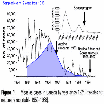
Yep, it looks completely different, though I'm using exactly the same technique as Dr. Obomsawin to generate this graph from the same original data. Now it seems quite compelling that measles were on the rise before the vaccine, rather than being on the fall, and that the vaccine pretty much wiped it out. This is what you can get when you discard most of the data, in a pattern of your own choosing, to get the result you want. Remember, his graph shows only 3 points before the vaccine, and the last of those was for a year where data was not available! That leaves just 2 valid data points, which he should know perfectly well is not enough.
And just look at the points he managed to hit with his 12-year spacing. The first just happens to be the highest point on the graph (well above average), and the second is a local minimum (below average). This gives the impression that the graph is dropping before the vaccine, contrary to what the data as a whole really tells us.
- Let's see what Meryl Dorey from the AVN
said about this:
- "For some reason, Dr Obomsawin `smoothed' the curve (normally called a spline or the line of best fit - a commonly-used scientific method of representing data in a graph)"
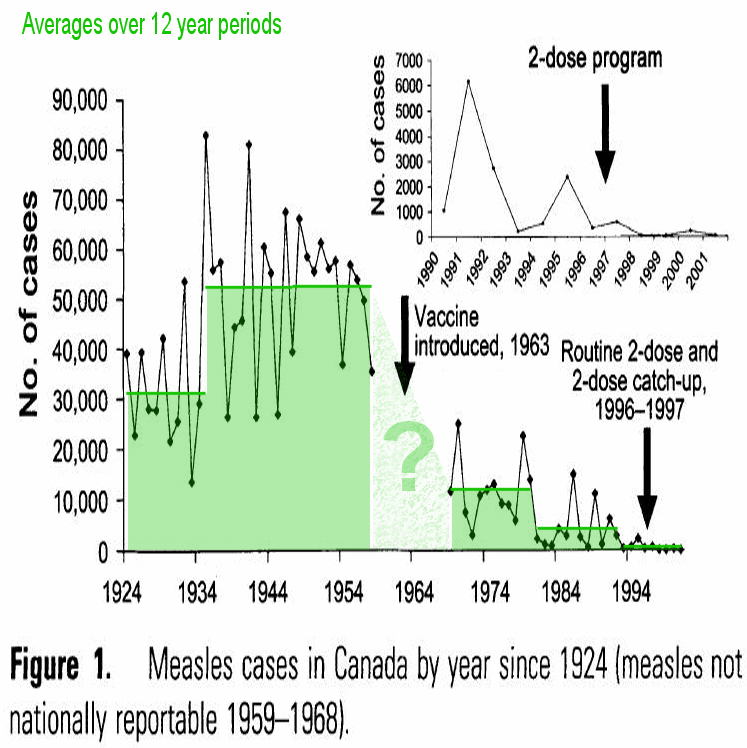
It would be great if he smoothed the curve, but he did not. He did not smooth the data, and he certainly did not use a spline or a line of best-fit. Smoothing doesn't just mean picking one point every 12 years and throwing the rest away. It may mean taking the average of data over 12 years, say. Everyone can agree that taking an average will give a more accurate picture, right? So that's what I've done below. This is presented as a bar graph, with each bar covering a 12 year period (except for the first and last bars for which less years are available).

Interestingly, the two 12-year periods before the vaccine was introduced, averaged out almost identically to each other, and higher than the preceding period. Looking at these averages we clearly see the positive effect of the vaccine.


Update: Dr. Obomsawin continues to mislead the public regarding vaccines, and continues to use the graph discussed above, as you can see in this 2012 video at the 44:50 mark. They have disabled comments of course, but you can still show your dislike for it. I did post a reply on their YouTube discussion board too which you're welcome to vote up!
* See also my Herd Immunity Simulator.
|
See all my products at: http://www.software3d.com Copyright © 2010-2025, Robert Webb |


|
Search terms: vaccine safety, vaccine efficacy, vaccine effectiveness, immunisation, vaccine, vaccination, vax, vaccinate, corona, coronavirus, COVID19, COVID-19, measles, flu, spread, anti-vax, antivax |